9 Elements for More Effective AI Image Prompts
- Lisa O
- Jan 2
- 4 min read
Updated: Feb 13

You know the moment. You are staring at your AI image generator, whether it is Midjourney, DALL·E, Gemini, or Firefly, typing some version of “create a professional image about…” and hoping this time will be different.
What you see is an image that's technically usable. Polished. But somehow both generic and slightly off. The composition feels weird, the colors don't quite work, something's just not right. When you're on a deadline, that's frustrating enough to make stock photos look tempting again.
I have been there. But with practice I made progress.
And what finally changed the outcome was not more prompting or better tools. It was realizing this: AI image generators do not think like search engines. They respond like designers. Once you treat your prompt like a design brief instead of a wish list, the results shift fast.
Why Most AI Image Prompts Fall Flat
Most people describe what they want to see. A team collaborating. A calm workspace. Healthy food. That's not wrong, but it is incomplete. It is like telling a designer “make it look nice” and expecting magic. And yes, I've done this.
Design has a vocabulary. Style, color, composition, lighting, mood. When you use that language, AI image prompts stop feeling random and start feeling predictable, in a good way.
That is where a repeatable framework comes in.
The 3-Phase Prompt Framework
Think of your prompt in three layers: foundation, scene, and polish. Skip one, and the image almost always feels off.
Phase 1: Foundation (Non-Negotiables)
Before you describe the subject, lock these in.
1. Style Direction
Pick one clear visual lane and stay in it.
Clean and minimalist
Warm and inviting
Bold and energetic
Sophisticated and refined
Mixing styles usually weakens the result. This part matters more than most people think.
2. Color Palette (2–3 colors max)
Letting the AI decide is how you end up with visual chaos.
Name specific colors
Indicate which color dominates
Match what already represents your brand
Constraint creates clarity.
3. Aspect Ratio
This saves you from cropping later.
Square (1:1) for social posts
Landscape (16:9) for blogs and YouTube
Vertical (2:3 or 9:16) for Pinterest and stories
Different tools handle this differently, but the rule is the same. Set dimensions upfront.
Phase 2: The Scene (How It Is Built)
Now you tell the AI how to arrange things.
4. Composition
This is about structure.
Centered for stability
Rule of thirds for flexibility
Asymmetric for energy
If you will add text later, ask for negative space. Almost always.
5. Lighting & Depth
Lighting controls mood more than people realize.
Bright and even feels modern and friendly
Directional and shadowed feels dramatic
Flat and shadowless feels graphic and clean
6. Mood
Use plain language here.
Calm
Confident
Optimistic
Energetic
If you cannot describe the feeling in a few words, the image will not land anyway.
Phase 3: The Polish (What Makes It Look Pro)
These details separate “good enough” from "good to go".
7. Image Type
Decide how literal or stylized you want to be.
Photo-realistic illustration
Minimalist 3D render
Isometric or diagram-style illustration
8. Text Handling
AI text is unreliable. Try to avoid it in the creation phase.
"No text. No words." Tip: Add text later using Figma or Canva to control output.
Specify where you want white space
Ask for high contrast if text will be added later
Another tip: If you create a banner image for your LinkedIn page, remember profile photos sit on the left. Leaving space there helps.
9. Texture & Material (Optional)
This adds subtle credibility.
Matte finishes
Soft gradients
Light grain or glass textures
Not always needed, but when it fits, it helps.
Here’s how the framework comes together in practice.

The Simple Prompt Formula
Once you have the elements, structure your prompt like this:
[Image type] + [subject] + [style] + [composition] + [colors] + [lighting] + [mood] + [text instructions] + [aspect ratio]
That's it. No filler.
Real Examples
Blog Header Image
Prompt example:
Editorial-style illustration representing strategic alignment and decision-making, abstract forms arranged with clear hierarchy, centered composition with generous negative space for headline overlay, muted neutral palette with soft accent tones, clean ambient lighting, calm and confident mood, no text, 16:9


Image source: Midjourney
LinkedIn Post Image
Prompt example:
Clean editorial illustration of a modern business workspace viewed from above, subtle visual cues suggesting process and organization (documents, screens, structured layouts), limited corporate color palette with neutral tones and one accent color, balanced composition with negative space on the left, soft even lighting, focused and professional mood, no text, square format, 1:1


Image source: Midjourney
Instagram Image (Brand / Insight Content)
Prompt example:
Photo-realistic image of a modern professional workspace with natural imperfections, vertical composition with strong focal point in upper third, neutral professional color palette with restrained accents, soft natural daylight, realistic depth and texture, calm and intentional mood, no text, vertical format, 2:3


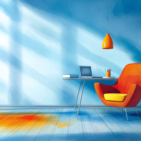
Image source: Midjourney
How to Iterate Without Starting Over
Even strong prompts need tweaks. The key is restraint.
Generate variations
Pick the closest result
Change one thing at a time. Color or lighting or composition.
Use remix or variation tools to keep what is working
Starting over every time slows you down.
Why This Works
This approach is not about making art. It's about building consistency.
Once your style, colors, and lighting preferences are set, image creation stops being a guessing game. You move faster. Your visuals start to look related. Your content feels intentional instead of assembled at the last minute.
No design degree required. Just clearer instructions.
Bottom Line
AI image generation gets easier when you stop asking for outcomes and start giving direction. You are not chasing perfect images. You are building a visual language your audience recognizes without thinking about it.
Whether you write prompts yourself or use AI to help draft them, the quality of the results still depends on the clarity of the direction you give.
Speak that language consistently, and the tools finally start meeting you halfway.
Want more practical ways for working smarter with AI? Check out HiveStir for actionable insights on AI tools, content creation, and productivity.